

In the world of data and analytics, understanding how two variables move together is fundamental.
For example —
- Do higher temperatures increase ice cream sales?
- Does more advertising lead to higher revenue?
- Do fertilizer inputs improve crop yield?
These relationships are captured by a powerful statistical concept called Correlation.
🔍 What is Correlation?
Correlation measures the strength and direction of a linear relationship between two variables.
In simple terms:
Correlation tells us how changes in one variable are associated with changes in another.
For instance:
- As temperature rises, ice cream sales also rise → positive correlation.
- As fuel price increases, car usage decreases → negative correlation.
- The number of pens owned and height of a person → no correlation.
🧮 The Correlation Coefficient (r)
The degree of correlation is measured using the Pearson’s correlation coefficient, denoted by r.
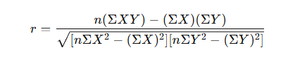
Where:
- X and Y = variables
- n = number of observations
📊 Interpretation of r
| Value of r | Relationship | Strength |
|---|---|---|
| +1 | Perfect positive | Very strong |
| 0.7 to 0.9 | Strong positive | Strong |
| 0.3 to 0.7 | Moderate positive | Moderate |
| 0 | No correlation | None |
| -0.3 to -0.7 | Moderate negative | Moderate |
| -0.7 to -0.9 | Strong negative | Strong |
| -1 | Perfect negative | Very strong |
🌡️ Example 1: Positive Correlation
Let’s look at a simple dataset:
| Hours Studied (X) | Marks Scored (Y) |
|---|---|
| 2 | 40 |
| 4 | 50 |
| 6 | 60 |
| 8 | 70 |
| 10 | 80 |
We can calculate the Pearson’s r using the formula.
Step 1: Compute intermediate values

Step 2: Apply the formula
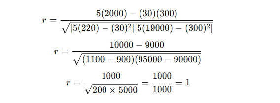
✅ Result: r = +1, indicating a perfect positive correlation.
As study hours increase, marks also increase in a perfectly linear way.
🧊 Example 2: Negative Correlation
| Temperature (°C) | Hot Chocolate Sales |
|---|---|
| 10 | 90 |
| 15 | 80 |
| 20 | 60 |
| 25 | 40 |
| 30 | 30 |
If you compute rrr, you’ll find r ≈ -0.96
→ A strong negative correlation — as temperature rises, sales fall.
🪞 Example 3: No Correlation
| Shoe Size | Intelligence Score |
|---|---|
| 5 | 110 |
| 6 | 120 |
| 7 | 115 |
| 8 | 118 |
| 9 | 116 |
If we calculate r, it will be close to 0, implying no relationship.
The size of shoes does not determine intelligence!
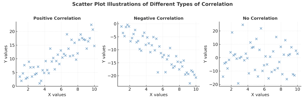
📈 Scatter Diagram (Graphical Representation)
A scatter plot is the easiest way to visualize correlation.
- Positive correlation: Points rise from bottom left to top right.
- Negative correlation: Points fall from top left to bottom right.
- No correlation: Points are scattered randomly.
🔸 Types of Correlation
| Type | Description | Example |
|---|---|---|
| Positive Correlation | Both variables move in the same direction | Height & Weight |
| Negative Correlation | One variable increases, the other decreases | Price & Demand |
| Zero Correlation | No relationship | Shoe size & IQ |
| Linear Correlation | Data forms a straight-line relationship | Study time & Marks |
| Non-linear Correlation | Relationship curves (not straight) | Stress & Productivity |
📊 Other Correlation Measures
| Measure | When Used | Notes |
|---|---|---|
| Pearson’s r | Both variables are continuous & normally distributed | Most common |
| Spearman’s rank (ρ) | Data is ordinal or not normally distributed | Based on ranks |
| Kendall’s tau (τ) | Small samples or tied ranks | Non-parametric |
📘 Example 4: Spearman’s Rank Correlation (ρ)
| Student | Math Rank | Science Rank |
|---|---|---|
| A | 1 | 2 |
| B | 2 | 1 |
| C | 3 | 3 |
| D | 4 | 4 |
| E | 5 | 5 |
Step 1: Compute difference in ranks (d)
| Student | Math Rank | Science Rank | d | d² |
|---|---|---|---|---|
| A | 1 | 2 | -1 | 1 |
| B | 2 | 1 | 1 | 1 |
| C | 3 | 3 | 0 | 0 |
| D | 4 | 4 | 0 | 0 |
| E | 5 | 5 | 0 | 0 |
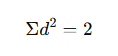
Step 2: Apply formula:

✅ Result: Strong positive correlation (ρ = 0.9)
📏 Key Points to Remember
- Correlation does not imply causation.
(E.g., ice cream sales and drowning incidents are correlated due to hot weather — not cause-effect.) - Correlation measures association, not influence.
- Outliers can significantly distort the correlation coefficient.
- Always visualize with a scatter plot before interpreting results.
💡 Real-World Applications
- Business: Sales vs. marketing spend
- Agriculture: Rainfall vs. crop yield
- Economics: GDP vs. employment rate
- Health: Exercise vs. body mass index (BMI)
- Education: Study time vs. exam performance
📚 Further Reading
- Field, A. (2022). Discovering Statistics Using SPSS. Sage Publications.
- Gujarati, D. N. (2020). Basic Econometrics. McGraw Hill.
- Jim Frost, Statistics by Jim – Correlation Explained Simply
- NIST e-Handbook: https://www.itl.nist.gov/div898/handbook/eda/section3/eda35.htm








Leave a Reply